Make it visibly attractive
When making your button, make sure the colours are visually striking. Visually striking colours attract the attention of visitors to web pages, so it is so important to use them.
In addition, the colour you use on your button is most effective when it is in strong contrast to the background on which it is placed.
No one can click on your CTA if they don’t even know it about. Visually, this should be highlighted on the page.
Here are three things to keep in mind when it comes to appearance:
Size: a larger CTA button or banner will stand out, but don’t overdo it. Having a CTA that is too large can be lost due to the blindness of the banners.
Regardless of the size you use, make sure it is large enough to read, but also to see and click on the mobile. While mobile device traffic is more important than ever, mobile performance should be a priority.
Apple recommends a minimum size of 44 x 44 pixels for anything that can be clicked. It is a good place to start.
Contrast: A simple general rule that allows your CTA to stand out is to create a contrast with the surrounding content. Vibrant colours are excellent for creating contrast and attracting attention.
To decide which colour to use, a good way to start is to look at the most used colours on your website or landing page design, then choose otherwise. You can also try using orange or red. These are generally accepted as the highest conversion colours.
Image: if you use an image or a custom design in your CTA, it must always be of high quality and relevant to the offer. Think about presenting an image of what you are proposing or maybe an image through which the audience can relate to you.
Pay attention to the language

The use of strong verbs and a language that encourages its users to perform an action is usually very successful. This means that instead of simply typing “Click here,” you should write “Click here now.”
The words that also work generally well are: save, download, create, etc. (but “save now” and not just “save”). You get the essence.
Discover ways to be direct with your readers as they are more likely to support and execute the actions that drive the growth of your business.
In order for your visitor to be clear about what to do next and why they need to do this, you want your CTA to directly reflect the message of the content that preceded it.
For example, if your CTA is at the end of an article entitled “16 ways to increase your ranking on old content” and you want to download a premium SEO guide, don’t just say “Download our free guide”. Ask your CTA to read something descriptive and memorize previous content, such as “Increase your SEO ranking even more with this free guide.”
Also, make sure the message is moved to the next step. For example, if your CTA leads to a landing page, use the same language as the blog post and CTA in its content to ensure relevance and avoid confusion.
If this landing page requests an automated email, use the same keywords again.
Consistency reduces confusion, creates a better user experience and makes your conversion path much simpler.
Do not take the location lightly

It is obvious that placing your CTA buttons in smart slots is an obvious step, but it is common for websites to put their buttons in a somewhat random location and expect everything to be fine.
The best locations for your call to action buttons include your header, footer or sidebar. You can also experiment with CTA buttons at the end of a blog post (or even in the middle) to be repeated again at the end.
Although the call to action buttons are important, it is important not to overdo it. If you put too many calls to action on your website, it is too good and counterproductive (and will reduce the number of clicks you will eventually get).
Only 47% of 500 companies’ websites have a call to action button that allows users to see in less than 3 seconds.
The placement of a CTA plays an important role in optimizing the conversion rate. While it is advisable to place your CTA in the upper half of the page, you should not follow it blindly. If your landing page is long, it is advisable to repeat the use of CTA so that you do not miss any opportunity to get the user’s attention.
The idea is to take into account the current position of your visitor in your purchase cycle (and your marketing funnel). Put yourself in their place and ask if you would respond to your CTA offer at that time.
If the answer is no, try a different location. The last thing you want to do is send spam to a potential client with a CTA that you are not interested in or for which you are not prepared.
Make your CTA action-oriented and worthwhile
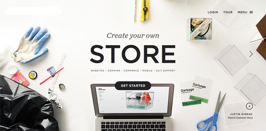
It seems obvious that your call to action should be action-oriented, but I cannot tell you how often I see CTAs that are not.
In order for your CTA to be action-oriented, you must consider the language you use in your copy, as well as the benefits your visitors would enjoy after clicking the button.
The more descriptive of the action you want your audience to perform and what they will get by clicking on this button, the better.
Here are some examples of an incorrect copy of CTA:
Click here
Download
Submit
Connect
Enter
Follow
Continue
All of these CTAs use an action-oriented verb, of course, but they don’t tell the viewer what they will get when they click on it.
Frankly, they all sound like work and the last thing that more people want or need on their plate is more work.
Instead of creating the illusion of work and establishing a “mental problem”, point out that your CTA should reflect a benefit; an action that your audience wants to achieve.
For example:
Get my eBook
Stay connected
Join the fun
Let’s talk
Give me more
Want to know more
When prospects see this type of copy in the CTAs, they don’t read it as a job. They read it while receiving something in return (and who doesn’t like gifts?).
They receive an e-book, keep in touch, have fun. Be creative (while making sense of the offer) and your CTAs will be much more attractive to potential customers.
A/B testing is important

From your copy to your colour and location, all of these things can affect the performance of your call to action and the only way to know which combination will offer the highest conversion rate is to try them.
Conversion rate optimization is critical to the success of inbound marketing and, fortunately, HubSpot, Optimizely and other marketing software have made the tests extremely simple.
According to HubSpot, here are some basic goals to achieve:
A click rate of 1 to 2%
A conversion rate of 10-20%
To achieve these goals with your CTAs, test the following:
Button colour
Copy / Messaging
Size
Location
Testing before executing is always beneficial. You get to know all the loopholes and drawbacks before others can point it at them.
These little calls to action buttons have the power to influence your sales and taking them for granted can only make things worse for your business.
The next time your sales and conversions decrease, consider having a look and experimenting a little with your call to action buttons.
A small change accompanied by smart planning can help you beat others and take your business to another level. Just keep these CTA tips that I mentioned above and of course do not forget to share your experience.




Everything is very open with a really clear clarification of the issues.
It was truly informative. Your website is very helpful.
Thanks for sharing!
Hello to every , as I am actually keen of reading this weblog’s post to
be updated regularly. It contains good information.
I am sure this post has touched all the internet people, its really really
pleasant article on building up new webpage.
You really make it seem so easy with your presentation but
I find this topic to be really something that
I think I would never understand. It seems too complex and extremely broad for
me. I’m looking forward for your next post, I will try to get the hang of it!
Hi mates, its impressive post regarding teachingand fully defined, keep it up all the
time.